RESPONSIVE CSS ?
- 1 La page vide
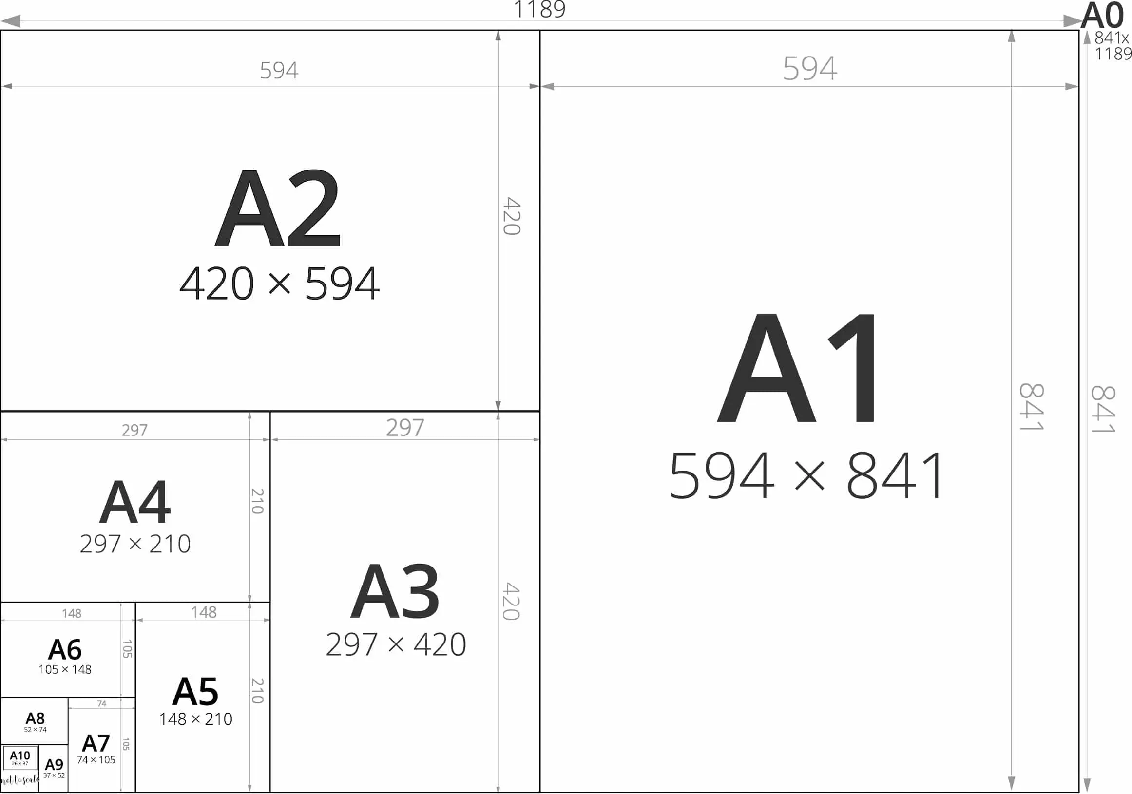
- 2 La lettre "A"
- 3 Le mot "rue"
- 4 Le paragraphe
- 5 Le jeu de morpion
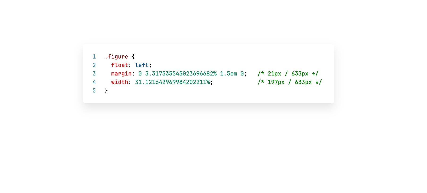
- 6 L'image de fond
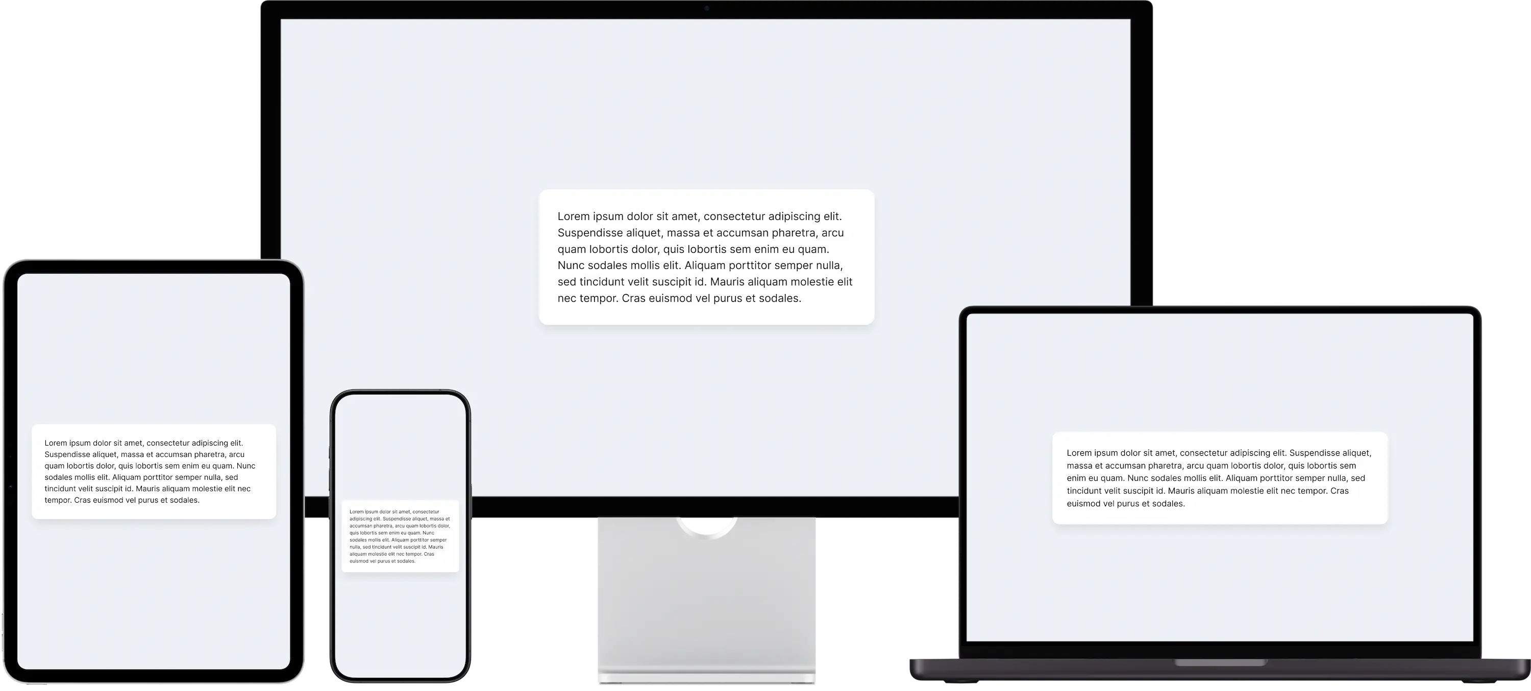
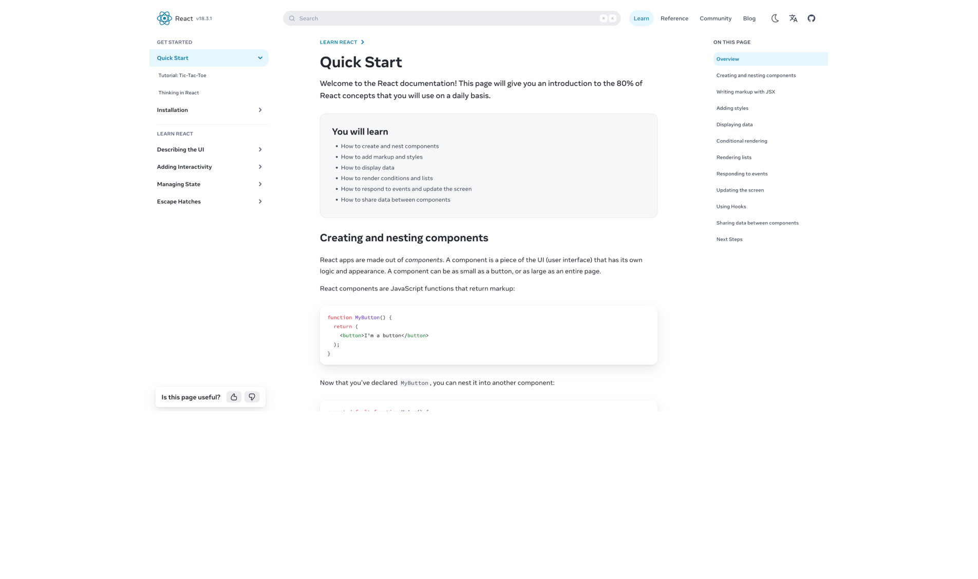
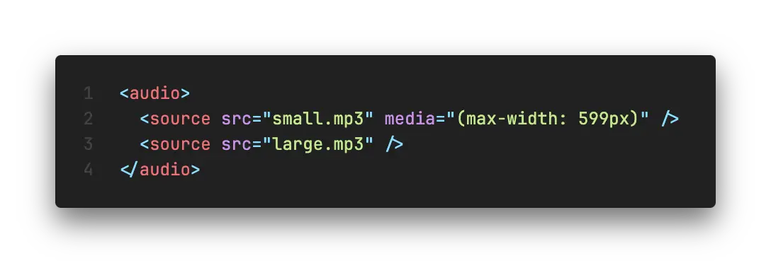
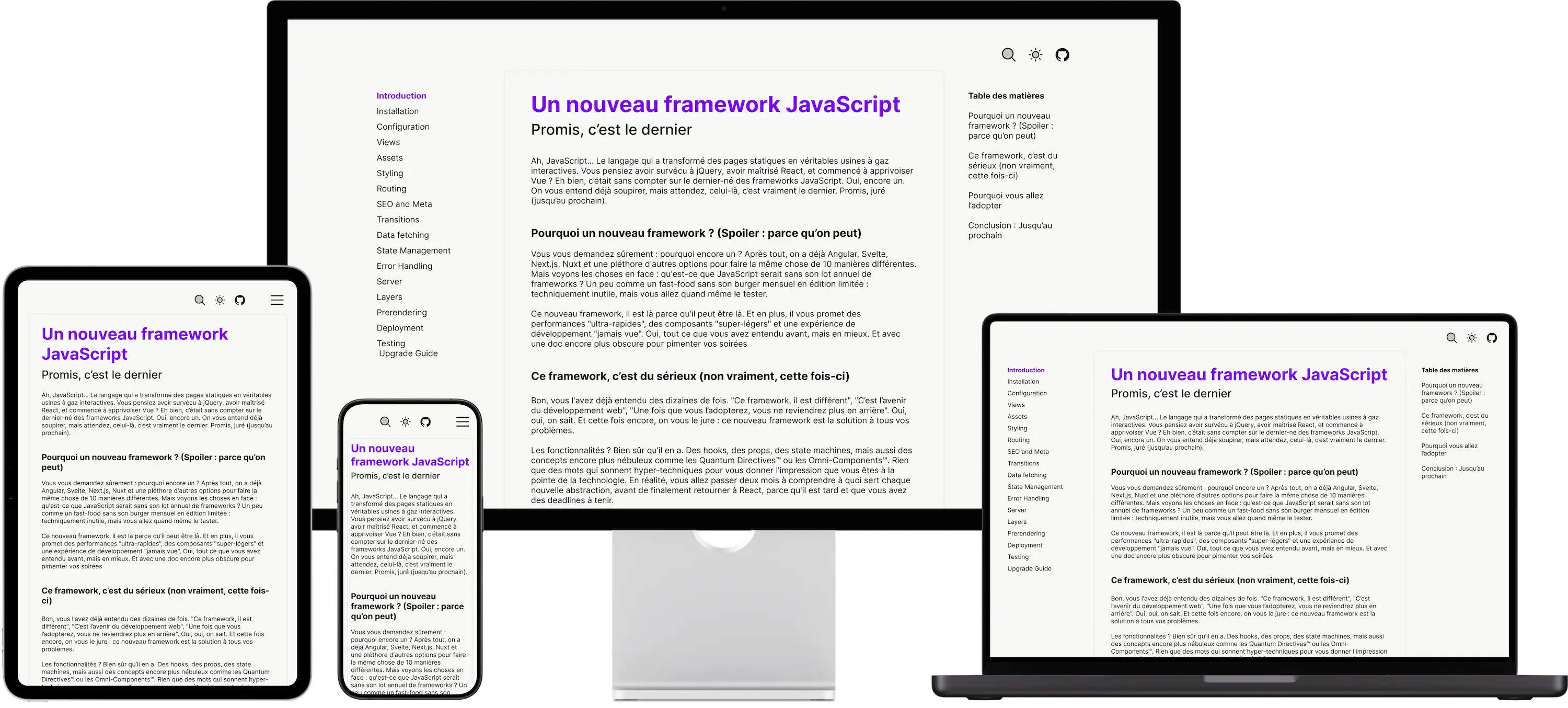
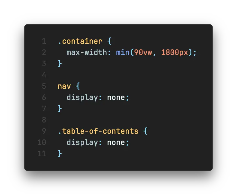
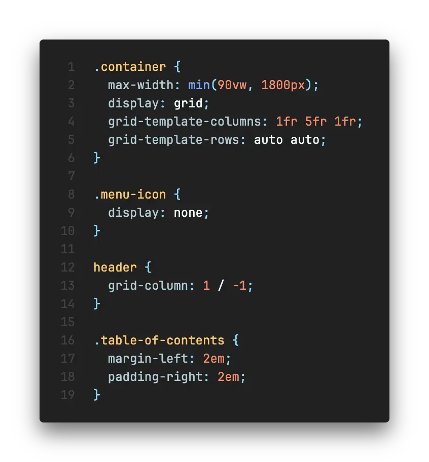
- 7 La documentation
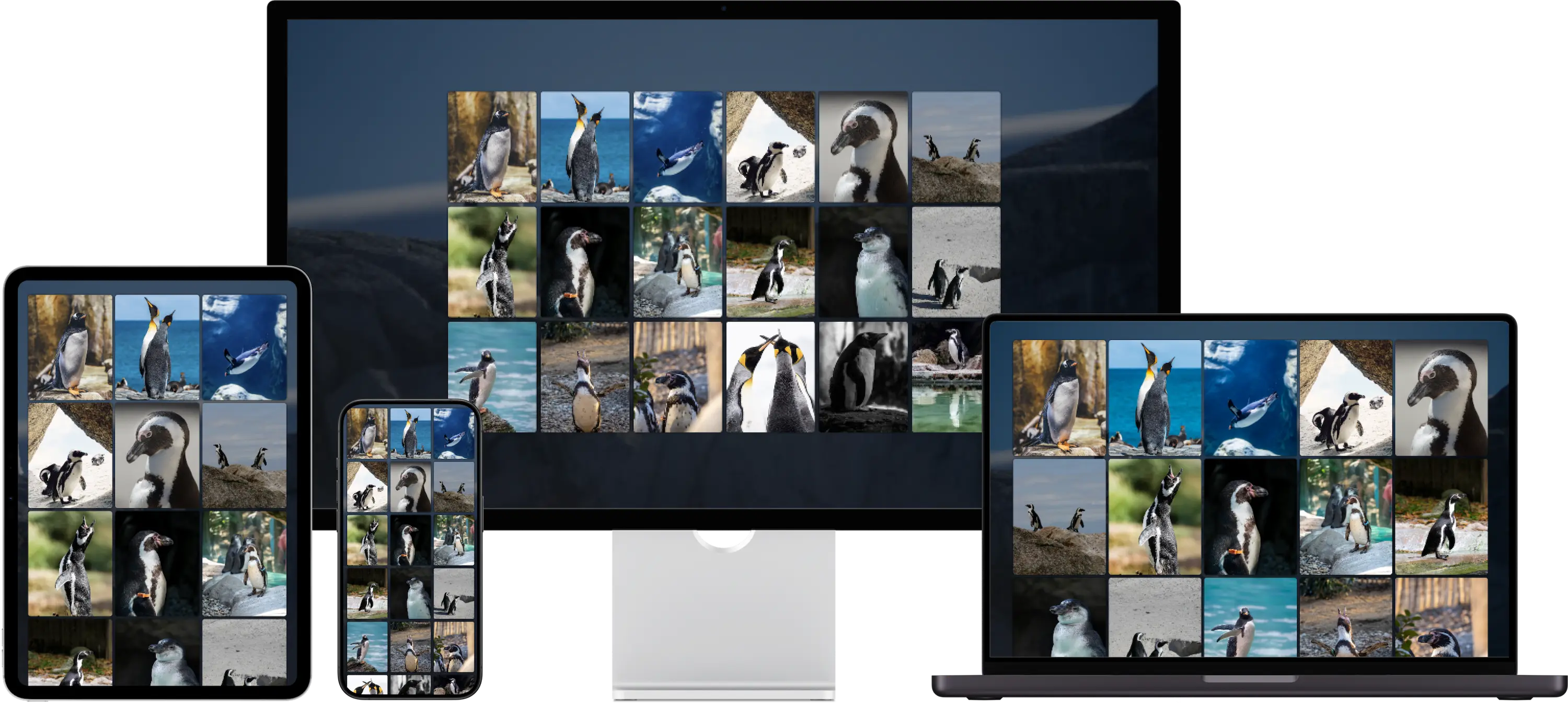
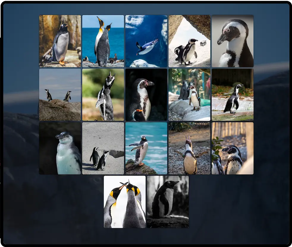
- 8 La galerie de photos
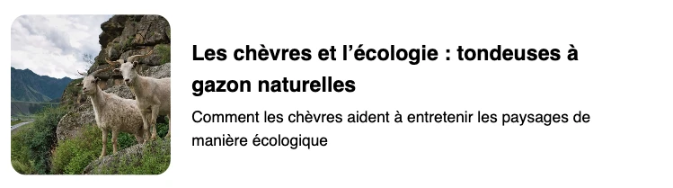
- 9 La plateforme de contenu
- 10 ???

.paper {
  display: block;
}
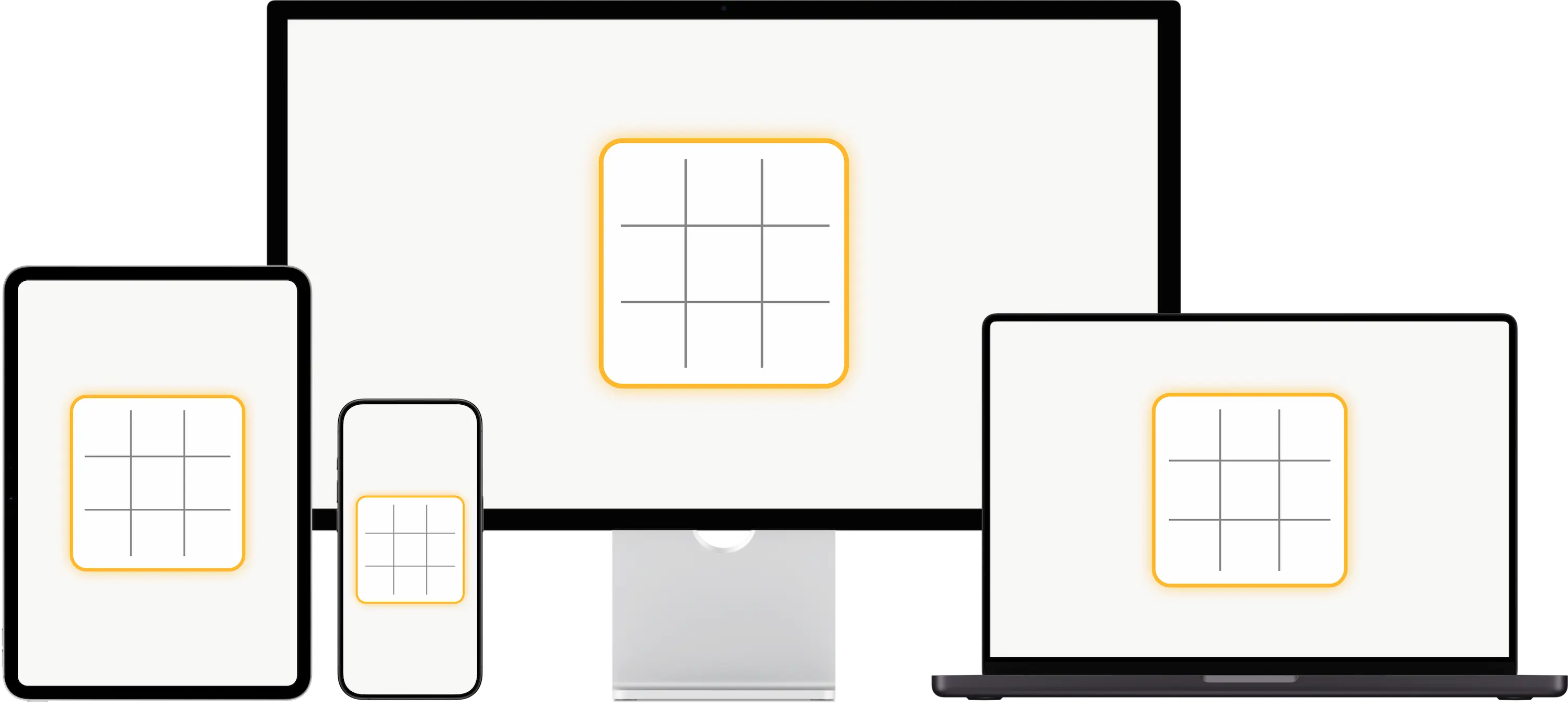
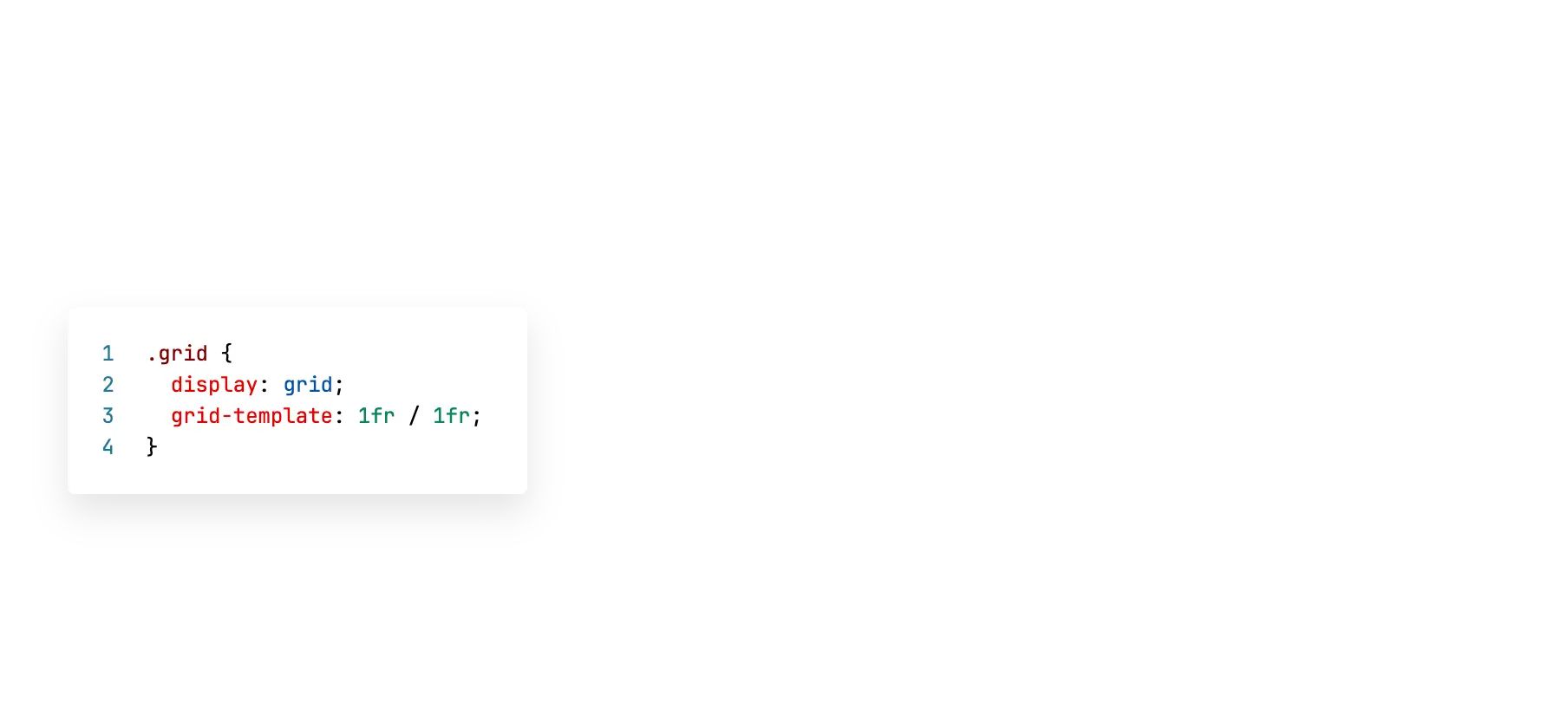
.board {
  width: 300px;
  aspect-ratio: 1;
}

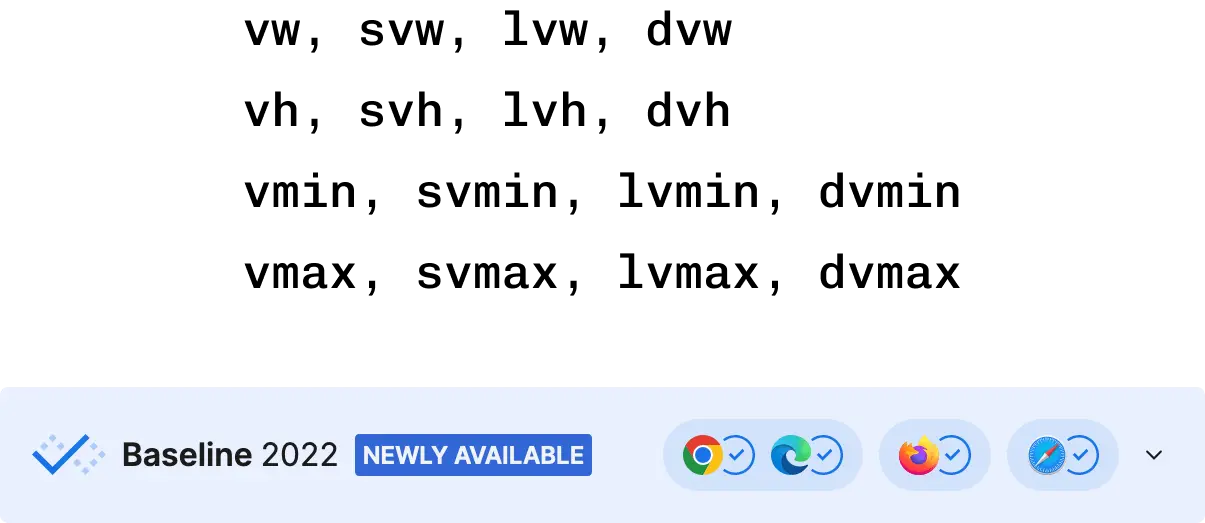
img {
  display: block;
  width: 100svw;
  height: 100svh;
  object-fit: cover;
}
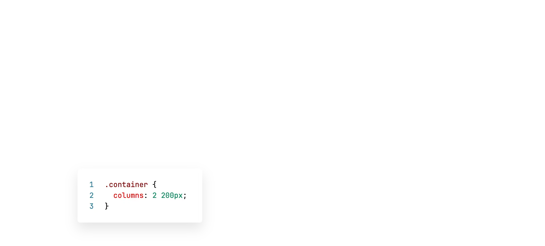
.page {
	max-width: 90vw;
}
Mais au fait...
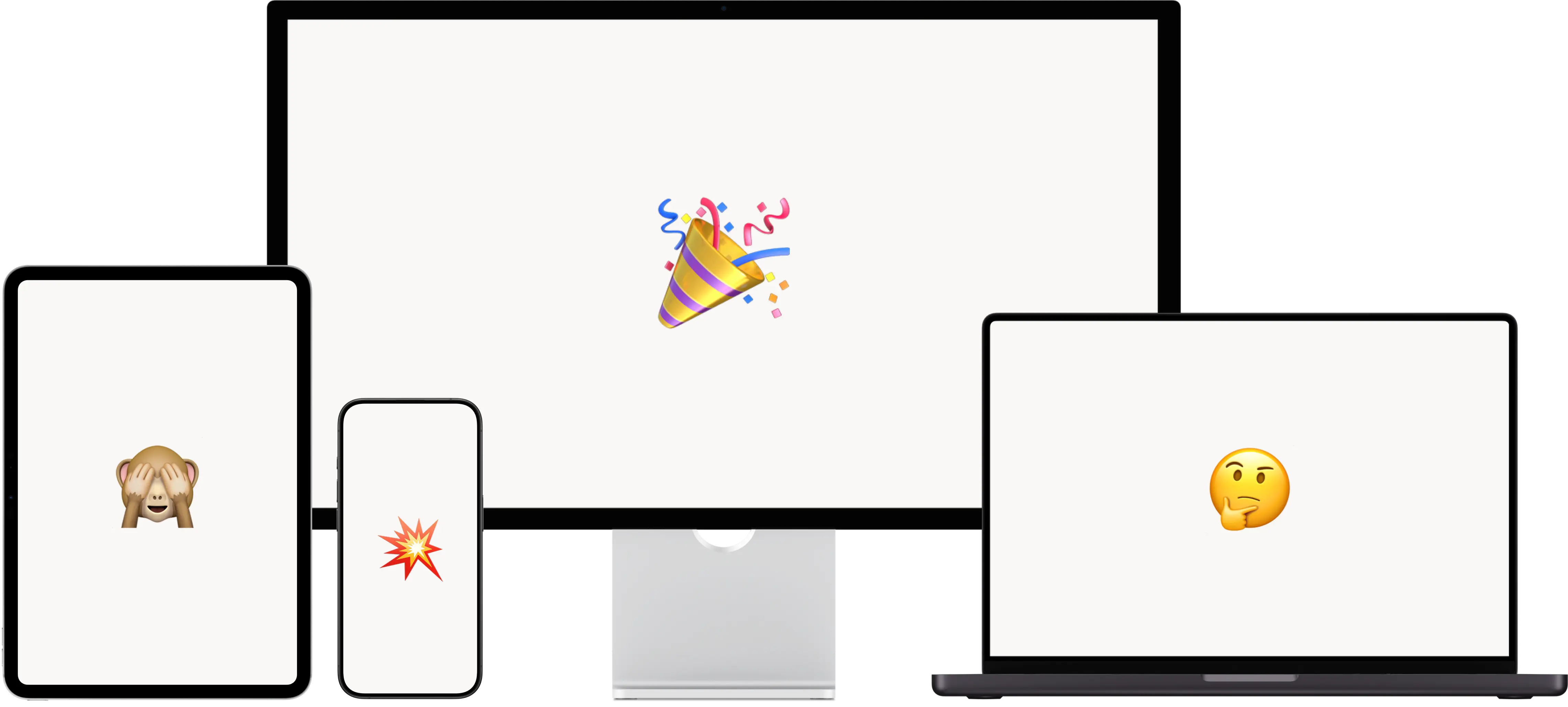
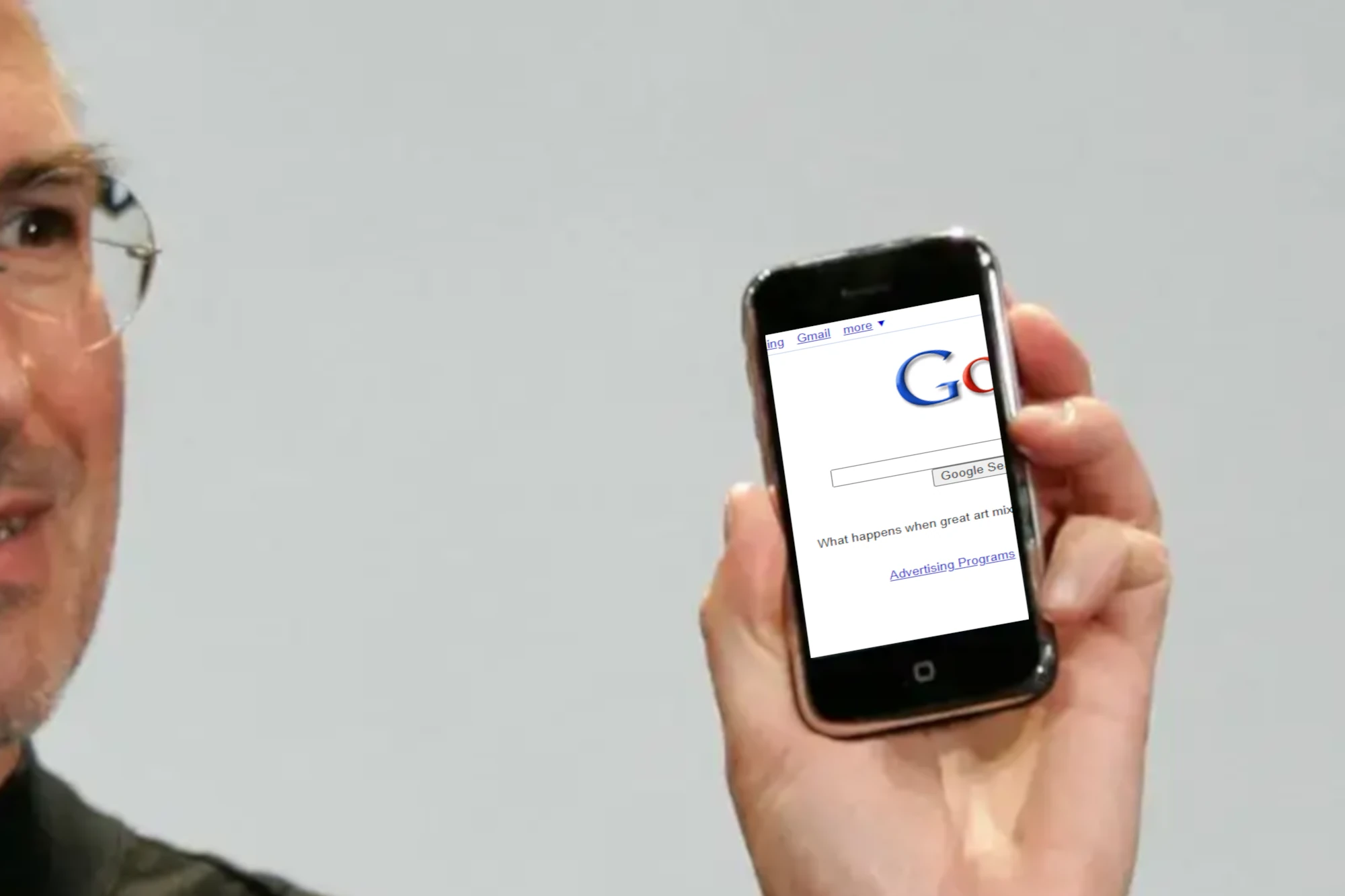
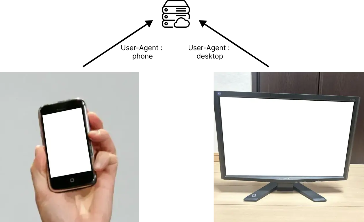
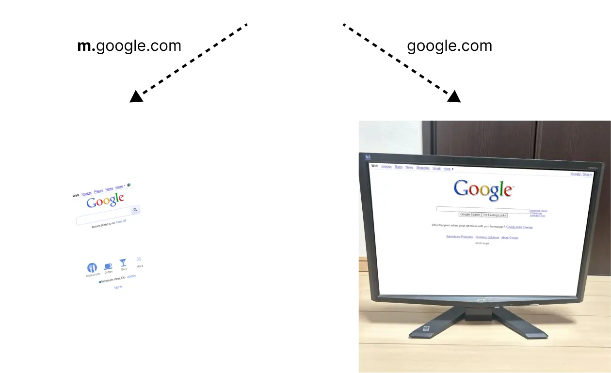
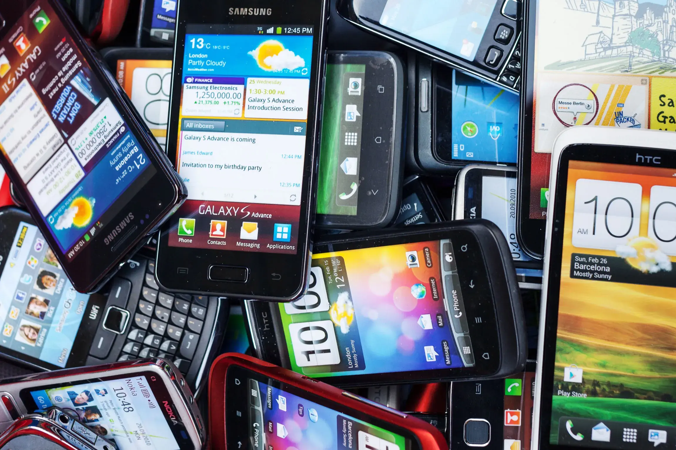
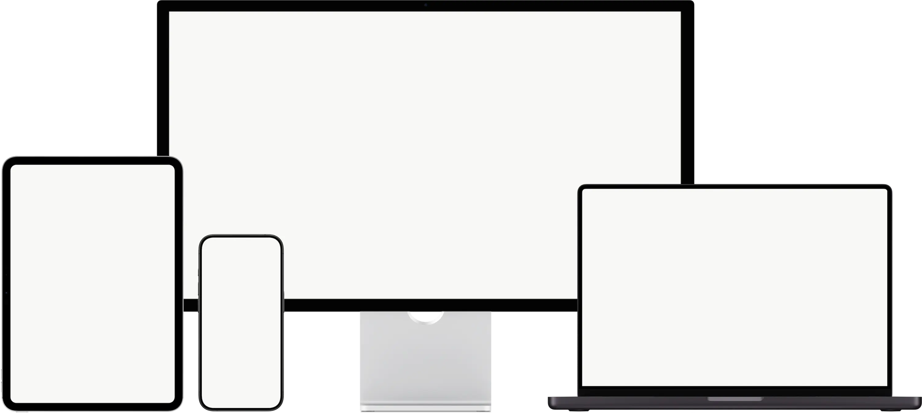
Mobile 📱
Bureau 🖥️


.gallery {
  width: min(90vw, 1600px);
  text-align: center;
}

img {
  width: 250px;
  aspect-ratio: 4 / 5;
}
/*


grid-template-columns: repeat(
  auto-fill,
  minmax(min(250px, 25vw), 1fr)
);

min-width: min(25vw, 250px);
flex-basis: 0%;
flex-grow: 1;

*/
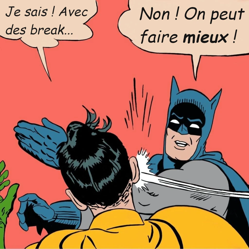
| Flexbox / Grid | Breakpoints | |
|---|---|---|
| Design | fluide | fixe par taille d'écran |
| Échelle | élément HTML | page entière |
| Effet | changement de taille et/ou position | n'importe quelle propriété CSS |
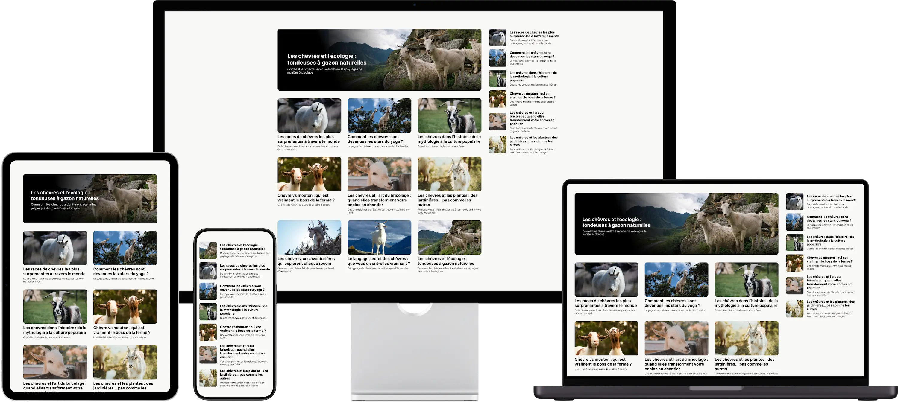


.content {
  display: grid;
  align-items: center;
  grid-template-columns: min(25%, 7em) 1fr;
  column-gap: 1rem;

  img {
    width: 100%;
    aspect-ratio: 1;
    object-fit: cover;
    border-radius: 0.75rem;
  }

  h1 {
    font-size: 1rem;
    margin: 0 0 0.25em;
  }

  p {
    font-size: 0.75rem;
    margin: 0;
  }
}

.content.medium {
  grid-template: auto auto / 1fr;
  row-gap: 0.5rem;

  img {
    aspect-ratio: 320 / 175;
  }

  h1 {
    font-size: 1.25rem;
  }

  p {
    font-size: 0.875rem;
  }
}

.content.large {
  grid-template: auto / 1fr;
  position: relative;

  &::before {
    content: "";
    width: 100%;
    height: 100%;
    position: absolute;
    left: 0;
    top: 0;
    border-radius: 0.75rem;
    background: linear-gradient(70deg, black 350px, transparent 700px),
      linear-gradient(to top, black -20%, transparent 30%);
  }

  div {
    position: absolute;
    max-width: 400px;
    margin-left: 8ch;
    color: white;
  }

  img {
    height: clamp(200px, 30vmin, 300px);
  }

  h1 {
    font-size: 1.5rem;
    margin-bottom: 0.5em;
  }

  p {
    font-size: 1.125rem;
  }
}
A place to share all my demos on CQs
Progress
60%
In Progress
Plan how to implement the new UI smoothly.
Todo
✔️ Apparence différente
❗Rôle fonctionnel identique
.content {
  display: grid;
  align-items: center;
  grid-template-columns: min(25%, 7em) 1fr;
  column-gap: 1rem;

  img {
    width: 100%;
    aspect-ratio: 1;
    object-fit: cover;
    border-radius: 0.75rem;
  }

  h1 {
    font-size: 1rem;
    margin: 0 0 0.25em;
  }

  p {
    font-size: 0.75rem;
    margin: 0;
  }
}

.content.medium {
  grid-template: auto auto / 1fr;
  row-gap: 0.5rem;

  img {
    aspect-ratio: 320 / 175;
  }

  h1 {
    font-size: 1.25rem;
  }

  p {
    font-size: 0.875rem;
  }
}

.content.large {
  grid-template: auto / 1fr;
  position: relative;

  &::before {
    content: "";
    width: 100%;
    height: 100%;
    position: absolute;
    left: 0;
    top: 0;
    border-radius: 0.75rem;
    background: linear-gradient(70deg, black 350px, transparent 700px),
      linear-gradient(to top, black -20%, transparent 30%);
  }

  div {
    position: absolute;
    max-width: 400px;
    margin-left: 8ch;
    color: white;
  }

  img {
    height: clamp(200px, 30vmin, 300px);
  }

  h1 {
    font-size: 1.5rem;
    margin-bottom: 0.5em;
  }

  p {
    font-size: 1.125rem;
  }
}
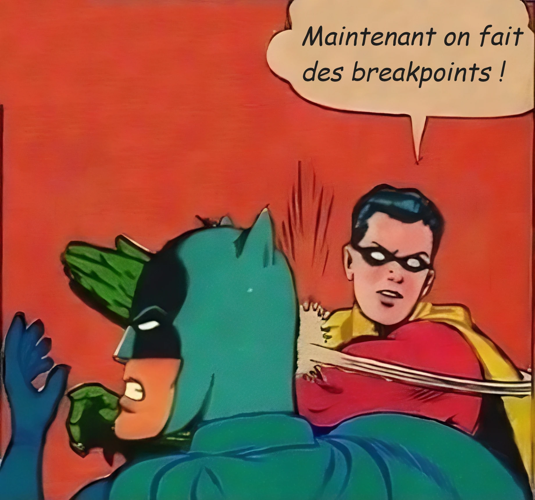
💡 Quelques suggestions sur les containers
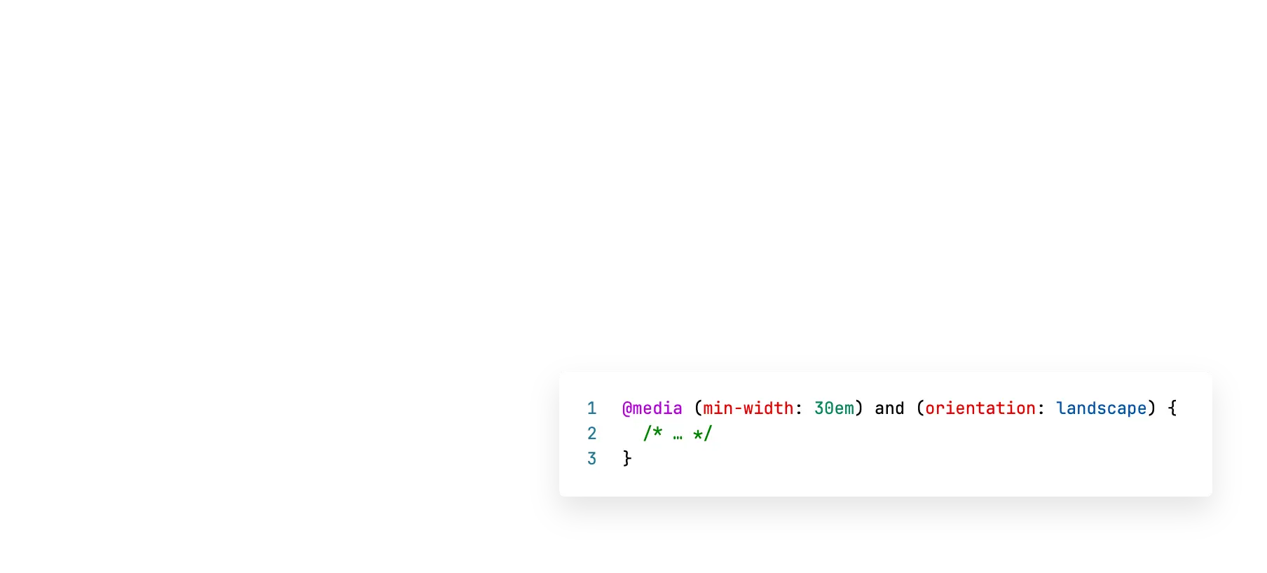
container: name / inline-size;) | Media Queries | Container Queries | |
|---|---|---|
| Cible | viewport | n'importe quel élément |
| Usage | modification globale de la page | modification locale d'un composant |
| Support navigateur | largement supporté | Baseline 2023 |